While
it is true that all the information you need to create and maintain a
Webcomic is available on the Internet, finding the stuff can be
difficult. For example, finding character design sheets and comic
storyboard sheets can be quite challenging, not to mention the problem
in finding a Manga A4-to-A5 Layout Board that you can actually get to
print
on your inkjet printer without losing the edges! We have brought
together these various elements and put them on this page to make your
life a little easier.
The downloads below are divided into three sections: fourteen design, plotting, and storyboard
sheets to help the artist
and writer create their characters and plot and organize the stories
they intend to tell; seven Comic
Art-boards used
in the
Comic industry today, both in Japan and in the U.S; and six comic-book
layout sheets (also called
signature ladders) to help you
fit your
comic into the appropriately-sized
book.
Comic
Art-boards
Comic
Art-boards are designed with specific goals in mind.
First, they are always much larger than the finished product you see in
print. For professional artists working with
physical media for printed publication, production art size is
critical. Most professional artists like working at least twice the
size of the final publication,
creating highly-detailed products that would be almost
impossible to do if the art were created at the finished size. This
larger
size also hides flaws and small imperfections in the artwork that might
be quite noticeable otherwise.
Second, the boards mark off those areas on the page where your artwork
and text are completely “safe,” anything you
place in this area is not
going to be cut off in the printing process.
Third the boards mark off the “trim” lines. These
lines mark where the paper is actually going to be cut after everything
is printed on the page. In printing
there is a slight
left-right-up-down paper movement of about one-eighth of an inch
(.125" -- 3.0 mm), so
text and
graphics placed in this area might be trimmed or cut off in some books.
Thus, while
your artwork could be perfectly centered on the page when it gets to
the
trimming machine, the page itself could have shifted one-sixteenth
(.0625") of an inch to the left, the following page could be
one-eighth (.125") of an inch lower relative to the first page, and the
next could be perfectly centered. There is no way to predict this
drifting, so any illustrations or text that extend into the area
between
the “safe” and “trim” lines could
be cut off in that process. If you have important art or text that you
absolutely must
have on the page, do not put it
in this area!
Finally, for those situations where
you want the illustration to go completely off the page,
there is a a third line about one-quarter of an inch (.25" -- 6.0
mm) outside the
trim line. This line is called a “bleed” line.
Any illustration or text that you want to run completely to the trimmed
edge of the paper must extend to the “bleed” line, which leaves
room for the slight movement of the paper as it goes through the
printing process and prevents a white border from showing.
We
recommend that no straight edge
borders, rule, or text be placed within .25" (6.0 mm) of the trim
edges.
Comic-book
Layout Sheets
The
comic-book layout sheets allow you to visually see how the pages in
your comic line up in a book format. This can be important if you are
planning to someday make your comic available as a book. Phil Foglio (Girl
Genius), for example, has said that when he went
to make Girl Genius into a printed book that all the double-page
spreads were split across two sides of the same page (i.e., instead of
being pages even-odd where you could see both pages at the same
time--such as 20-21--they were back-to-back, that is pages 19 and 20).
He had made an error in calculating how the pages would fit in a book
while drawing the webcomic. This required that he re-draw a single page
into two pages so that the following pages were properly paginated.
After that experience he always makes sure the pages fall where he
needs them in the printed book before deciding on putting up a
double-page webcomic.
When
planning a book you need to be aware of the how printers
create books. All books are laid out in what are called signatures. The
simplest is the 4-page signature, which is just a single sheet of paper
folded in the middle.Thus if your comic book is formatted with 8.5"x11"
pages, it is actually printed as four 8.5"x11" pages on a
single 11"x17" sheet of paper. Knowing where your pages are going to be
when printed on this sheet of paper is important. This also means you
must pay attention to how many pages are in your comic. If you
decide on a 38-page comic-book you are going to have two blank pages at
the end (38/4 = 9.5 sheets of paper). Additionally, Flying Chipmunk
Comics Press requires that the last page of the book be blank, no text
or graphics. We put a bar-code on that last page so it can be
matched to the book’s cover. For a color comic book, which always uses
4-page signatures, the easiest way to do this is to make sure
that the page count is divisible by four and that the final scene in
the comic book is a double-page spread, which will automatically leave
the last page blank. For a black-and white comic 6"x9" and smaller the
signatures are 6 pages each, if the comic is larger than 6"x9" then the
signatures are four pages, just like the color comics.
To
make it easy to layout your book, we suggest that you print
a thumbnail of each page of your comic and paste it into the
appropriate place on the layout sheet.
The
Files
All
the aids and boards on this page are designed to print in
non-reproducing blue ink (RGB values - 164, 221, 237) and are in
PDF file format. You print these boards and use them as the starting
point of any page or you can open these in a digital environment and
place
them on a layer underneath your comic. When you are
finished, turn off that layer, save the comic in
the format you use on you website, and your comic is ready for the
internet. Don't forget to also save the original in a high-resolution
format so that the artwork is ready for publication when you decide to
produce it in book form.
Which
art-board you use depends on your plans for publishing. As long as the
ratios of width and length reduce to the proportions you want to use in
your
book, it really doesn't matter.
You are free to use these aids and boards however you wish, but please
do not give them away to others, we are making them available here for
free as advertising for our services. You can, if you
want, provide a link to this page from your website. If you know of any
other aids that we should have here, please drop us note at “editor
(at)
FlyingChipmunkComicsPress (dot) com”.
Back to Top
| Comic
Planning Aids --
All sheets formatted for 8.5" x 11" paper |
|
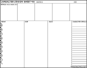
 Character Design
Sheet (Horizontal). Front/ Side/
Back
views plus description and detail areas with a “head” ruler on the
left. Character Design
Sheet (Horizontal). Front/ Side/
Back
views plus description and detail areas with a “head” ruler on the
left. |
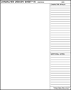
 Character
Design Sheet (Vertical). Large image
area plus room for description and details. Character
Design Sheet (Vertical). Large image
area plus room for description and details. |
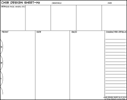
 Chibi
Design Sheet (Horizontal). Front/ Side/
Back
views plus description and detail areas with a “head” ruler on the
left. Chibi
Design Sheet (Horizontal). Front/ Side/
Back
views plus description and detail areas with a “head” ruler on the
left. |
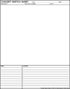
 Concept
Sketch Sheet. For your
characters, their accessories, equipment, vehicles,and anything else
you might want to sketch out for your comic. Concept
Sketch Sheet. For your
characters, their accessories, equipment, vehicles,and anything else
you might want to sketch out for your comic. |
 |
 |
 |
 |
|
|
|
|
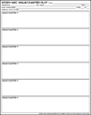
 Story-Arc Issue/ Chapter Plot
Sheet (Vertical). Short notes
and descriptions, chapter- by- chapter -- 6 panels. Story-Arc Issue/ Chapter Plot
Sheet (Vertical). Short notes
and descriptions, chapter- by- chapter -- 6 panels. |
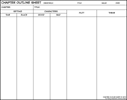
 Chapter Outline Sheet
(Horizontal). Columns
for Setting/ Characters/ Plot/ Theme descriptions. Chapter Outline Sheet
(Horizontal). Columns
for Setting/ Characters/ Plot/ Theme descriptions. |
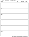
 Page-Panel Script &
Description (Horizontal). Plot the page
for your artist, panel by panel -- 6 panels. Page-Panel Script &
Description (Horizontal). Plot the page
for your artist, panel by panel -- 6 panels. |
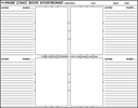
 4-Page Comic Book Storyboard
(Horizontal). Arranged
as two 2-panel spreads, with room for notes beside each page. 4-Page Comic Book Storyboard
(Horizontal). Arranged
as two 2-panel spreads, with room for notes beside each page. |
 |
 |
 |
 |
|
|
|
|
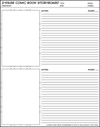
 2-Page
Comic Book Storyboard (Vertical). One
above the other with room for notes beside each page. 2-Page
Comic Book Storyboard (Vertical). One
above the other with room for notes beside each page. |
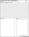
 1-Page
Comic Book Storyboard (Vertical). Room
for plenty of notes on layout and dialogue. 1-Page
Comic Book Storyboard (Vertical). Room
for plenty of notes on layout and dialogue. |
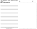
 1-Page
Comic Book Storyboard (Horizontal). Same
as above, but with a larger sketch area. 1-Page
Comic Book Storyboard (Horizontal). Same
as above, but with a larger sketch area. |
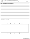
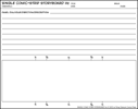
 Single American Daily-Comic-Strip
Storyboard (Vertical). For
sketching ideas and making early placement notes. Single American Daily-Comic-Strip
Storyboard (Vertical). For
sketching ideas and making early placement notes. |
 |
 |
 |
 |
|
|
|
|
 Single American Daily-Comic-Strip
Storyboard. (Horizontal). Same as above,
but with a larger sketch area. Single American Daily-Comic-Strip
Storyboard. (Horizontal). Same as above,
but with a larger sketch area. |
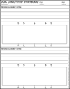
 Dual American Daily-Comic-Strip
Storyboard (Vertical). One
above the other with room for notes beside each page. Dual American Daily-Comic-Strip
Storyboard (Vertical). One
above the other with room for notes beside each page. |
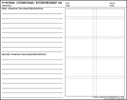
 4-Koma
(Yonkoma). Comic
Storyboard (Horizontal). Full-page
for two strips side-by-side, or a single double-wide. 4-Koma
(Yonkoma). Comic
Storyboard (Horizontal). Full-page
for two strips side-by-side, or a single double-wide. |
|
 |
 |
 |
|
|
Back to Top
| Comic Art-boards --
Paper size as indicated |
|
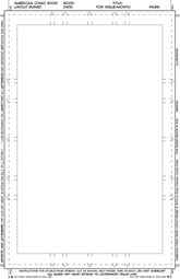
 American Standard Comic Art-board
-- 11" x17" paper size. An 11" x 17"
board that uses 67% reduction to get to the printed comic size of 6 5/8
× 10 1/2". American Standard Comic Art-board
-- 11" x17" paper size. An 11" x 17"
board that uses 67% reduction to get to the printed comic size of 6 5/8
× 10 1/2". |
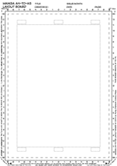
 A4-to-A5 Manga Art-board --- A4
paper size. A 21 x 29.70
cm (8.26 x
11.69") board, it uses 70.7% reduction to
get to the printed comic size of
14.8 x 21.0 cm (5.83 x 8.26"). A4-to-A5 Manga Art-board --- A4
paper size. A 21 x 29.70
cm (8.26 x
11.69") board, it uses 70.7% reduction to
get to the printed comic size of
14.8 x 21.0 cm (5.83 x 8.26"). |
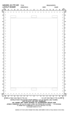
 A4-to-A5
Manga Art-board -- 8.5" x 14" paper size. Same
as above, but will print on Legal size (8.5 x 14") paper without
cropping. A4-to-A5
Manga Art-board -- 8.5" x 14" paper size. Same
as above, but will print on Legal size (8.5 x 14") paper without
cropping. |
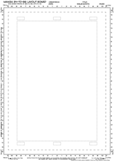
 B4-to-B6
Manga board -- B4 paper size. The
Japanese professional size, 25.7 x 36.4 cm
(10.12 x 14.33"),uses an 80%
reduction to
get to the printed comic size --
12.5 x 17.6 cm (4.9 x 6.9"); but a 67% reduction will result in an
A5 format: 14.8
x 21.0 cm
(5.83 x 8.26"). B4-to-B6
Manga board -- B4 paper size. The
Japanese professional size, 25.7 x 36.4 cm
(10.12 x 14.33"),uses an 80%
reduction to
get to the printed comic size --
12.5 x 17.6 cm (4.9 x 6.9"); but a 67% reduction will result in an
A5 format: 14.8
x 21.0 cm
(5.83 x 8.26"). |
 |
 |
 |
 |
|
|
|
|
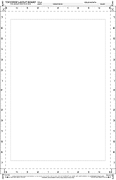
 Tokyopop Art-board -- 11" x17"
paper size. Although
Tokyopop no longer publishes manga, they set the standard for
American Manga books,
using a 5 x 7.5" finished format that was a compromise
between the A5 and
B6 formats used in Japan. This board is 11 x 17" and uses a 50%
reduction. Tokyopop Art-board -- 11" x17"
paper size. Although
Tokyopop no longer publishes manga, they set the standard for
American Manga books,
using a 5 x 7.5" finished format that was a compromise
between the A5 and
B6 formats used in Japan. This board is 11 x 17" and uses a 50%
reduction. |
 4-Koma (Yonkoma) Comic Art-board
-- 8.5" x 14" paper size. Based
on the A4 page size, the 4-Koma
(Yonkoma) Comic
is a 4-panel vertical comic that is as popular in
Japan as the
horizontal Daily Comic is
in America. It is frequently used
in Manga at the end of regular chapters as non-canon “bonus” material.This Art-board
prints on Legal size paper (11x14") and uses a 70.7% reuction. 4-Koma (Yonkoma) Comic Art-board
-- 8.5" x 14" paper size. Based
on the A4 page size, the 4-Koma
(Yonkoma) Comic
is a 4-panel vertical comic that is as popular in
Japan as the
horizontal Daily Comic is
in America. It is frequently used
in Manga at the end of regular chapters as non-canon “bonus” material.This Art-board
prints on Legal size paper (11x14") and uses a 70.7% reuction. |
 American
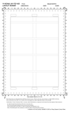
Daily-Comic-Strip Art-board -- 8.5" x 14" paper size. A
14
x 6" ( 35.5 x 15.3 cm) board, prints on Legal size paper. Newspapers
differ on
reduction of artwork, between 5 7/16" (42%) and 6" (46%)
is typical.
The title of the comic is added by the syndicate/newspaper to the top
of the strip. American
Daily-Comic-Strip Art-board -- 8.5" x 14" paper size. A
14
x 6" ( 35.5 x 15.3 cm) board, prints on Legal size paper. Newspapers
differ on
reduction of artwork, between 5 7/16" (42%) and 6" (46%)
is typical.
The title of the comic is added by the syndicate/newspaper to the top
of the strip. |
|
 |
 |
 |
|
|
Back to Top
| Comic-Book
Layout
Sheets -- All sheets formatted for 8.5" x 11" paper |
|
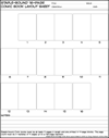
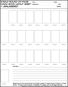
 Staple-bound 16-Page Comic Book
Layout Sheet. 16 numbered
page-blocks so you can see which pages are available for double-page
spreads. Staple-bound 16-Page Comic Book
Layout Sheet. 16 numbered
page-blocks so you can see which pages are available for double-page
spreads. |
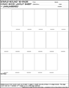
 Staple-bound 16-Page Comic Book
Layout Sheet (un-numbered). Un-numbered
page-blocks for comic-books with more than 16 pages. Staple-bound 16-Page Comic Book
Layout Sheet (un-numbered). Un-numbered
page-blocks for comic-books with more than 16 pages. |
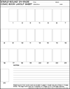
 Staple-bound 24-Page Comic Book
Layout Sheet. 24 numbered
page-blocks so you can see which pages are available for double-page
spreads. Staple-bound 24-Page Comic Book
Layout Sheet. 24 numbered
page-blocks so you can see which pages are available for double-page
spreads. |
 Staple-bound 24-Page Comic Book
Layout Sheet (un-numbered). Un-numbered
page-blocks for comic-books with more than 24 pages. Staple-bound 24-Page Comic Book
Layout Sheet (un-numbered). Un-numbered
page-blocks for comic-books with more than 24 pages. |
 |
 |
 |
 |
|
|
|
|
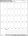
 Staple-bound 32-Page Comic Book
Layout Sheet. 32 numbered
page-blocks so you can see which pages are available for double-page
spreads. Staple-bound 32-Page Comic Book
Layout Sheet. 32 numbered
page-blocks so you can see which pages are available for double-page
spreads. |
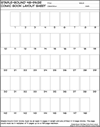
 Staple-bound 48-Page Comic Book
Layout Sheet. 48 numbered
page-blocks so you can see which pages are available for double-page
spreads. Staple-bound 48-Page Comic Book
Layout Sheet. 48 numbered
page-blocks so you can see which pages are available for double-page
spreads. |
|
|
 |
 |
|
|
|
Back to Top


